Accela Insights Reporting Service Overview
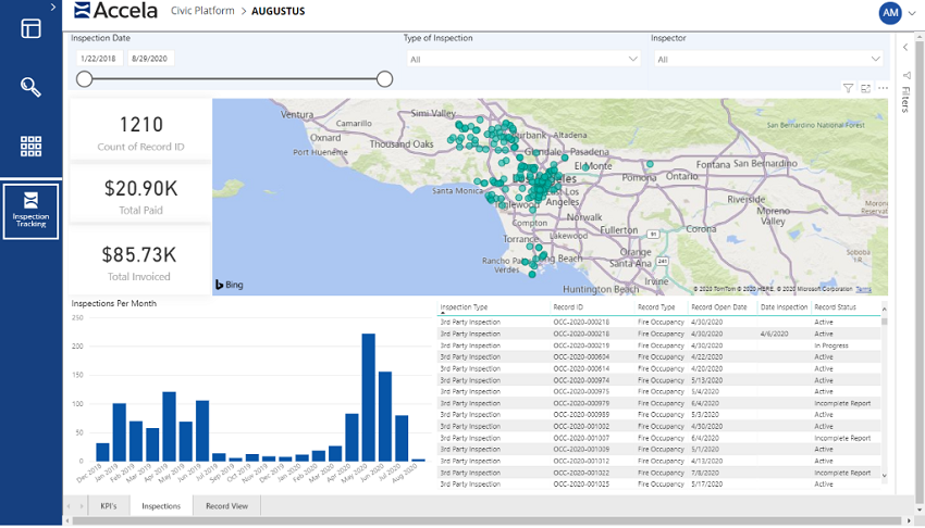
The Accela Insights Reporting Service is a data visualization tool powered by Microsoft Power BI that you can use to create modern, interactive dashboards within the Civic Platform. Its intuitive, drag-and-drop interface lets you create everything from simple data visualizations and dashboards to sophisticated, interactive dashboards that display complex data in a coherent, visually immersive, and interactive manner. You can use its wide array of data visualizations—which includes maps, bar charts, graphs, and much more—to present complicated data in a way that's easy for users to understand and manipulate. You can deploy Accela Insights dashboards with the same Report Manager usability and features used for other Accela report services, organizing dashboards in reports folders or adding them directly to users' home screens where they'll see them each time they log in.

Users can interactively filter the report data used for the visualizations, allowing them to access data through business terms they are familiar with and understand.
Some key uses of Accela Insights interactive dashboards include:
- Monitoring department metrics.
- Tracking daily operations and performance.
- Providing analytics to identify trends for week-over-week, month-over-month, and year-over year.
- Tracking key performance indicators.
- Tracking inspection activities.
Accela Insights is offered to SaaS customers as part of their seat license cost, and is not available for on-prem customers.
Note:
|