Using the Dashboards in the Oxygen UI
The Dashboard Toggle on the top of the Main Menu bar provides access to the Task Dashboard as well as the Map Dashboard. The following sections discuss in more detail how you can use both dashboards to work efficiently and effectively.
Topics
Switching Between Dashboards
The Task Dashboard displays by default when you log in or when you return to the home page. However, a Map Dashboard is also available that offers a map-centric view. The dashboard toggle, located at the top of the Main Menu bar, lets you switch between the two dashboards.
To toggle between dashboards:
Click the dashboard toggle at the top of the main menu.

- Choose
 for the Task Dashboard.
 - Choose
 for the Map Dashboard.
Task Dashboard
The Task Dashboard is your to-do list, calendar, and work tracking venue.
You can interact with your tasks in both the card view and the list view. Each view has distinct benefits, and many users like to switch between views to take advantage of functionality that is unique to one view or the other.
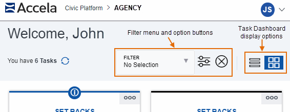
The two views have some options in common, including the display option buttons to
switch between Card View ( button) and List View (
 button), as well as a Filter menu and filter buttons that
gives some control over which tasks display.
Topics:
Card View
This is the default view for the Task Dashboard. Task cards provide a nice visual for browsing, but more importantly, they also provide a significant amount of relevant information and functionality that can help you plan your course of action to address your task. Six tasks display by default when the page first loads. Use the Load More link to view more of your tasks.
Features of the task cards:
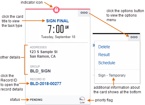
- Card titles - Task card titles tell you at a glance what the task is.
Click titles in blue text to open the task details in a new space, which
includes the task type.Note: If the task name displays in black text, you do not have permission to view the task details.
- Times/dates - Most tasks have a scheduled time/date, a due date, or other relevant date (such as the date of the last status change). This information displays in different locations on the card, depending on what type of task it is. For example, the document review task in the image above shows a last status update date of April 27. The activity task on the right shows a due date of July 3 and a start date of June 29.
- Description - Some tasks have a short description of the activity or task to be performed.
- Record ID - The relevant Record ID for the task. Click the Record ID link to open the record details.
- Other Details - Task-centric details can tell you something about how you should interact with that task. Different task types offer different details, such as the due date, addresses necessary for the inspection, the group assigned to the task, etc. For example, if the record includes an application name (also known as project name), an application name assigned to the record shows on the card. Or you can preview documents for document review tasks.
-
Options button - Every task card has a slide-out panel that provides you with a list of actions you can perform on the task. Slide-out panels may also provide hyperlink access relevant records, such as a permit record or a primary contact. The actions you can perform varies by task type.
-
Status - Some task types display the task status prominently on the task card. The document review task above shows the status along with the date that the status last changed. The activity task above shows the status immediately below the task card title.
-
Priority flags - Some tasks have a priority flag. Find it in the lower left-hand corner.
This shows the priority of the task as low (
 ), medium (
 ), or high (
 ).
).Indicator icons - Certain conditions, such as holds, notices, locks, or required steps are applicable to a task or to the record from which a task originates, you see one of these icons displayed prominently in the center of the task card:
 - Required - This condition is unique to workflow tasks. You must
complete an activity or field before you can proceed to the next
activity.
 - Lock - This condition (severity 1) prevents you from
performing any operations on locked records, owners, parcels, and
others.
 - Hold - This condition (severity 2) prevents you from
performing certain operations.
 - Notice - This condition (severity 3)
indicates special instructions to the person who completes the record.
This does not inhibit the record process in any way.
When you see one of these icons, you can click the Record ID open the record and learn more about the reason it is in place. The notice displays at the top of the page.
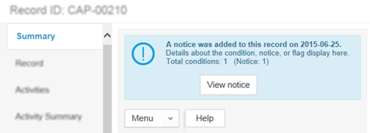
If you need even more detail than this, click View notice to open the condition details in a new window.
Task Card Examples
Figure: Example Inspection Task Card
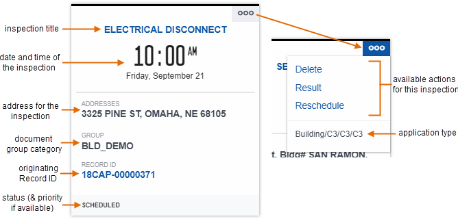
Figure: Example Document Review Task Card
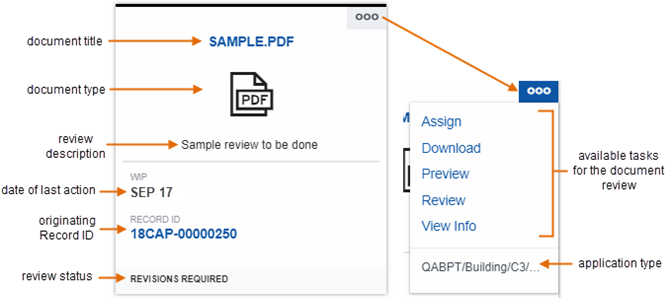
Figure: Example Activity Task Card
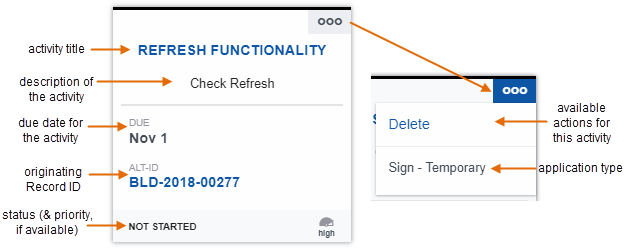
Figure: Example Workflow Task Card
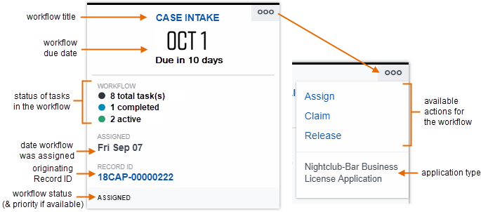
Figure: Example Meeting Task Card
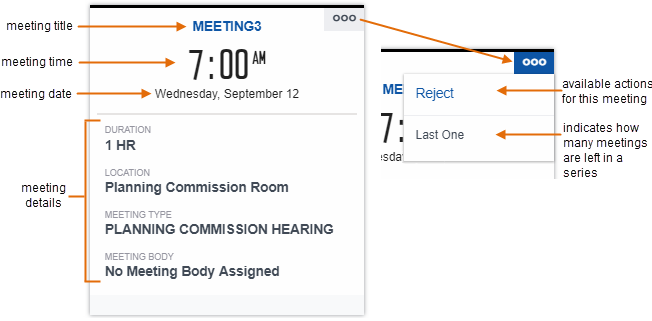
List View
The task list view gives you the ability to view many tasks at once in a table format. This can be very useful when you want to compare like values for differing tasks.
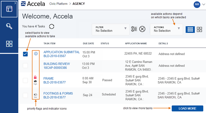
Features of the task dashboard list view:
- View Tasks - Task items are listed in a table format. Six tasks display by default when the page first loads. Use the Load More link to view more of your tasks.
- Actions - Perform actions on one task or select multiple
tasks and perform a batch action on them. The list of actions available for you
to perform varies, depending on the type and quantity of tasks you want to
perform an action upon.
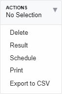
For example, if you select a single document review task and click the Actions button, the available actions you can perform on a document review task display.
Details on the Title Bar - Key information about the tasks displays on the card, including important data such as due date, schedule time, comments, and more.
- Times/dates - Most tasks have a scheduled time/date, a due date, or other relevant date (such as the date of the last status change). This information displays in different locations on the card, depending on what type of task it is. For example, the document review task in the image above shows a last status update date of April 27. The activity task on the right shows a due date of July 3 and a start date of June 29.
- Status - Some task types display the task status prominently on the task card. The document review task above shows the status along with the date that the status last changed. The activity task above shows the status immediately below the task card title.
- Other Details - Task-centric details can tell you something about how you should interact with that task. Different task types offer different details. For example, if the record includes an application name (also known as project name), an application name assigned to the record shows on the card. Or you can preview documents for document review tasks.
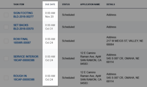
For example, you can quickly compare due dates of assignments in your queue:
Figure: Comparing Data in List View
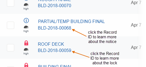
Flags - Some tasks have a priority flag, which will be indicated in this column. Also, when conditions, holds, notices, or locks are applicable to a task or to the record from which a task originates, you see one of these icons displayed:
 - Required - This
condition is unique to workflow tasks. You must complete an activity or
field before you can proceed to the next activity.
 - Lock - This condition prevents you
from performing certain operations on locked records (severity 1).
 - Hold - This condition prevents you
from performing certain operations (severity 2, less severe than a
lock).
 - Notice - This
condition indicates special instructions to the person who completes the
record. This does not inhibit the record process in any way (severity
3).
If you have tasks with conditions, you can click the Record ID in the list view for more information, just as you would in the task card view.
Map Dashboard
The Maps Dashboard provides you with another way to identify and analyze land-use, zoning, inspection or service request routes, infrastructure, and other geo-centric information. Accela GIS 10.0.0 introduces the latest and greatest maps infrastructure, built on the power of Angular technology to provide a responsive, high-speed experience for map-centric users.
See Civic Platform User Guide - Maps in the Oxygen User Interface to learn more.